EPOS MSL data catalogue - Website Design and Development
Project
Product design & full-stack development
Oct 2024 - Jul 2026Skills
Backend De...
Component...
Frontend A...
UI Design
Approaches
Iterative...
Service De...
User-Cente...
Tools
Laravel
Leaflet
PHP
PHPUnit
PhpSpreads...
TailwindCS...
TypeScript
Vite
daisyUI
Topics
Controlled...
FAIR Data
Geospatial...
Research D...
Mentioned In
About
I was responsible for the public frontend of the EPOS MSL data catalogue and contributed to backend systems behind it. My work included the visual language, reusable interface components, search and map experiences, surveys, vocabulary tooling, and public contribution flows. Workshops and research that informed this work are covered in Vision, Mission, Strategy and Workshops.
The work used Laravel and Blade, TypeScript, Tailwind CSS and daisyUI, Leaflet, Vite, and metadata and API work around DataCite and CKAN.
Colour system and frontend rebuild
The existing Bootstrap frontend needed updating, and repeated markup made page changes slow.
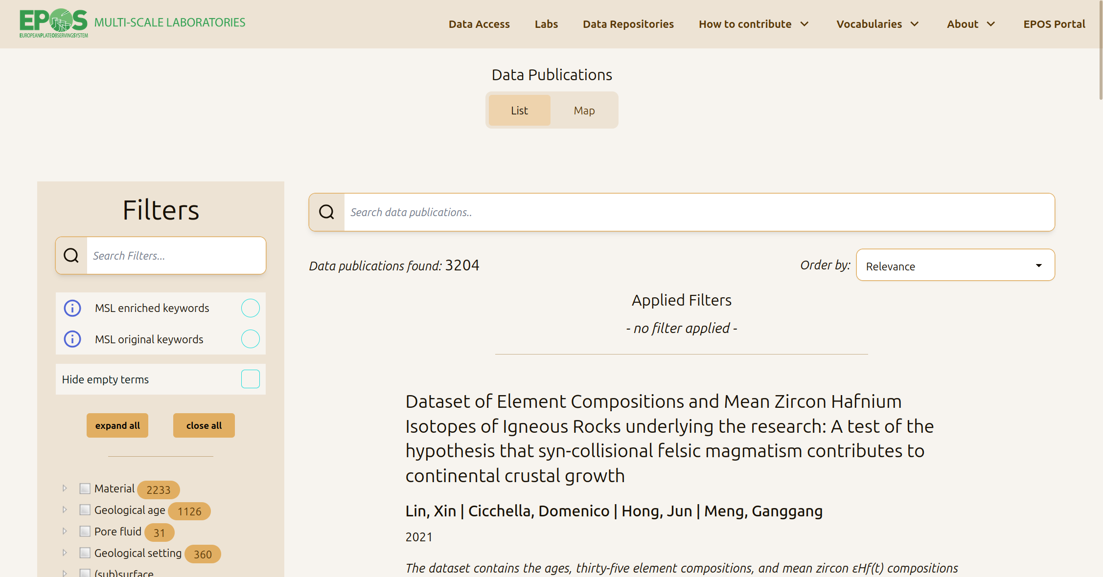
I developed the colour palette and design language, then moved the app to Tailwind and daisyUI with a custom theme. Shared Blade components replaced repeated markup: tabs, tables, word cards, pagination, search and filter trees, and list/map variants for labs and equipment. I rebuilt the home, about, data access, repository, and publication-detail pages, and repeatedly improved navigation, filters, and map/list layouts on smaller screens.
The result is a consistent catalogue interface and a frontend that is easier to update.
Search, detail pages, and the map
People look for this information in different ways: by DOI, location, laboratory, or equipment.
I worked on data-access search and filters, including facets, result counts, applied filters, and pagination. I built publication-detail tabs for descriptions, files, and maps. I also built the publications map: users draw a bounding box with Ctrl-drag, the page requests GeoJSON, clusters markers, changes between inclusive and exclusive matches, and connects map markers to sidebar results. I also fixed Leaflet styling and cluster redraw issues.
Survey product
Domain scenarios needed structured intake and feedback without a bespoke form for every subdomain.
I designed the data model and built the survey system: surveys, ordered questions, question-type components, responses and answers, validation rules stored per question, handling for inactive surveys, and honeypot protection. Domain scenarios came from the research on the related project. A later fix made the placeholder option the default instead of selecting the first real answer.
Research, sketches, and expert analysis behind these scenarios are covered in Vision, Mission, Strategy and Workshops.
Vocabularies in Excel for domain authors
Domain experts edit controlled vocabularies in spreadsheets. The import and export process needed to preserve tree structures and metadata.
I built an Excel-to-JSON-to-database conversion for indented multi-level sheets, exports with column descriptions, per-domain converters, and selection groups for keyword subsets in dropdowns. I also fixed spreadsheet edge cases, such as boolean 0 exporting as a blank cell.
Experts can keep using Excel while the catalogue receives consistent terms for keyword selection and filtering.
Also shipped
- DataCite version-aware mapping into catalogue publications
- Facilities and GeoEnergy REST API with bounding-box filters
- Contact and contribute forms, confirmation mail, honeypot on public forms
- Large Eloquent relation rename and test restructure (maintenance, small commits)
The focus was clear orientation and usable contribution steps. The catalogue supports searches by DOI, laboratory, equipment, and location, and it gives contributors practical routes for keywords, surveys, and contact. The work was delivered incrementally across about two years in a production codebase with more than 2,000 commits.
Recommendation Letter
Related Highlights
Click to see details